Want to make your brand more prominent on the exhibition floor? Here’s an introduction to exhibition graphics
Whether you’re attending a tradeshow or presenting a new product, you want your exhibition stand to be the centre of attention. Eye-catching stand graphics are one of the best ways to achieve this.
Your exhibition stand graphics obviously need to stand out but what else should you consider to make your brand more visible? In this article, we give you our expert advice.
How to Make Your Exhibition Graphics Stand Out?
Generally speaking, your exhibition graphics are divided into three categories.
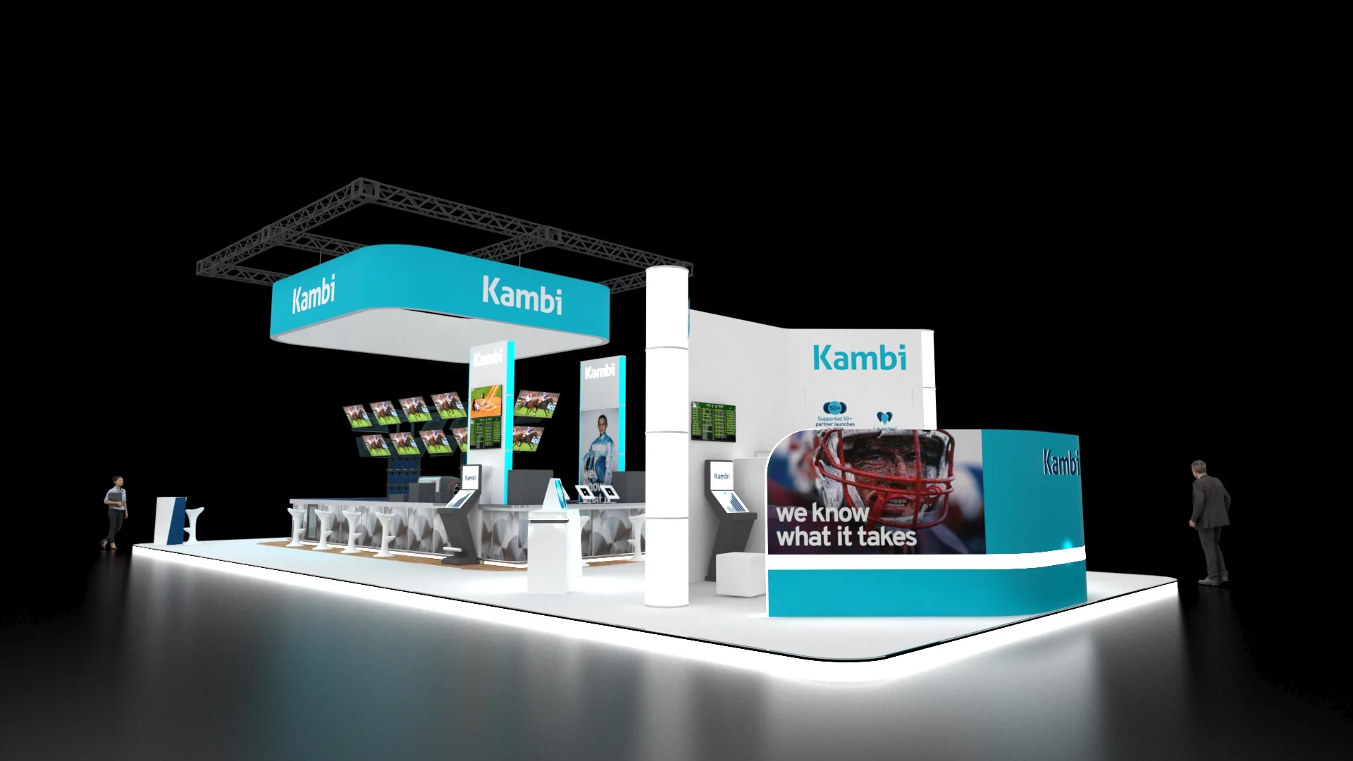
The first type of graphics are the ones your visitors will see from a distance. These need to be big, bright, bold and simple so they can have maximum visibility. Often the more distant graphics will show no more than your logo and branding as longer text can get lost at that distance.
Once your visitors get closer you want to grab their attention with some show-stopping mid-range graphics. In general, these are designed to be readable at a distance of 10 to 50 feet. Because of this you still don’t want to include too many words – a tagline or slogan is ideal for this.
When visitors are right by your stand, you should utilise short-range graphics to provide further information. Since these are designed to be read within 10 feet, you can include more details. This can include product ranges, services, or anything else you think your stand visitors need to know about your brand. It’s preferable to place short-range graphics at eye level to make them easier to read.
Here are a few more ideas for making your graphics more visible:
Have a Clear Brand Message
Since the exhibition floor is such a busy place, it’s essential to be explicitly clear with your messaging. Think about what you want to convey to your visitors and what you want them to take away from visiting your stand. This is what should guide all aspects of your exhibition design.
Go Big or go Home
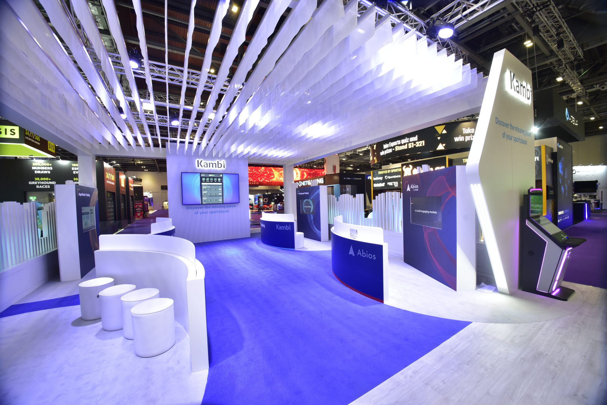
Possibly the simplest way to grab the attention of potential stand visitors is by being big and bold. As we have already discussed, to give your brand the best visibility on the exhibition floor, you have to use a clever mixture of large-scale and medium-scale graphics.
When you think about it from a visitor’s perspective, a short bold statement will create a much bigger impact than a long sentence.
Consistency is Key
The colours you choose will set the tone of your stand so make sure you use colours that match your brand’s personality. Your brand has to be recognisable and leave visitors with an impactful memory. Your stand design and graphics should complement each other and come together to create a seamless image that shares your brand’s story and values with potential customers.
Select High-Quality Imagery
Since your exhibition graphics will be printed in a large format or displayed on big screens, you want to use only the highest-quality imagery. Low-quality images get distorted and blurry during the rendering and printing process and this is the last thing you want.
For logos and illustrations, it’s preferable to use vector graphics as they don’t lose quality when being resized.
Set Things in Motion
Motion graphics and videos are a fantastic way to make your exhibition stand really attractive to visitors. The trick when using video is having the appropriate hardware and a secure internet connection.
We would also always ensure there is a specialist responsible for the audio-visual equipment on the day, so the whole process goes smoothly.
Achieve Great Results with Generation Exhibitions
Our team of experienced designers, project managers, and stand builders use their creativity and expertise to elevate your brand to the next level.
With many years in the exhibition stand design industry, we offer the complete package including graphic design services to help bring your brand to life. Send us your brief today and we’ll be in touch to discuss your ideas.


